Some subtle interface tweaks went live across all Prevue accounts over the weekend — which were combined with a few additions and updates to the project feedback tab.

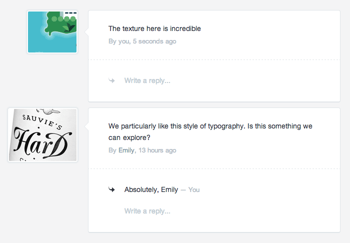
Aside from the visual overhaul, you might notice two subtle additions to the Feedback tab, specifically in image annotations. Firstly, the actual annotated crop of your image is shown beside the comment. Most annotations are simply "I like this bit", or "change this colour" — so cropping to the annotated area gives you much better context of what your client is referring to.
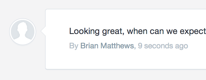
Secondly, all threaded comments are shown on each annotation - including the ability to reply to that annotation without leaving the page. This has been a heavily requested feature, and will be updated again soon to include optional email notifications for your clients when they receive new replies (some legal compliance stuff to figure out first).
Re-align
If you read this blog regularly, you might have gathered that there's an almost endless amount of UI tweaking happening behind the scenes. This update is no different — and comes with some big updates to the alignment of the app which benefit users with large screens.
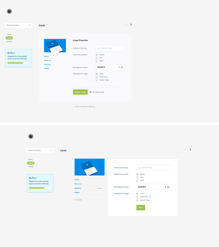
Before/After of the Image Edit section...

Specifically, the app has been centered to your screen — which makes it a lot easier for your eye to navigate through different sections if you use a large monitor (which, as it turns out, a lot of you do). You'll also see a bunch of tweaks around the place, including in Edit, Settings and Stats.
Finally, there have been some retina updates - for those of you who use retina displays, or happen to use Prevue zoomed in at 200%

Eloise Carolan
Brayden
Kristian Langner
John Doe
Blake Sebastian
Tilly Beck
Erma Byers
Kami Nakamura
Geraldine Wienholt
Mr. Philip Parham
Phil Keener
Phil Armitage
Phil Fossey
mr. philip Velasco
mr. phil Parra
Phil Schonell