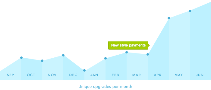
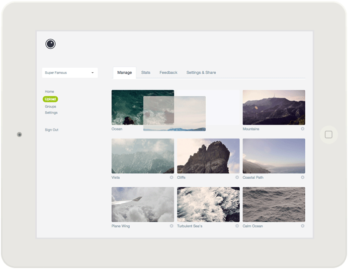
In 2013, I started investigating ways to improve conversions within Prevue - an undertaking that took the best part of a year, but resulted in a 120% increase in revenue. In Part 1 of this article, I outlined how I went about improving engagement, below I'll explain how I tackled conversions.
Growth hacking - Part 1
In Behind the scenes
I was faced with a dilemma, how to increase profit without changing the "feel" of the product? Hiding features or using tricky tactics isn't how I like to do business, so instead, I did the opposite. Here's how I increased conversions by 120%, and engagement by 4x without losing my soul.
Year in review
In Behind the scenes
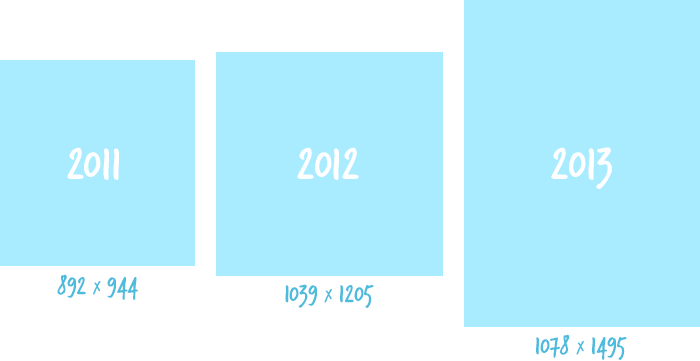
Well it's been one hell of a year for Prevue, which turned 5 years young in January. As the year comes to a close, and you start to wind down your jobs for Christmas, I thought I'd take a moment to share some of the more interesting stats and observations that can be made from the past 12 months.
The motorcycle diaries
In Behind the scenes
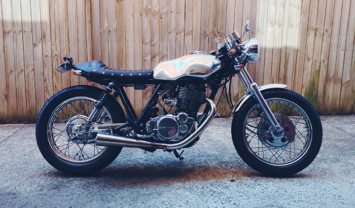
This week the Prevue servers have experienced some significant issues that have prevented uploading, deleting and editing of images — and in some cases have frozen accounts entirely. And whilst it's only affected a very small percentage of accounts, I've been working around the clock (literally) to diagnose and fix the problem. In the interest of transparency I wanted to elaborate a bit, and explain what's being done...
The 3rd party
In Behind the scenes
A week after launching Prevue in 2008, I found myself discussing the app over a beer with fellow Londoner Daniel Howells, owner of SiteInspire. And whilst I can't remember exactly how the conversation went, I clearly remember at one point he suggested I look into Amazon Web Services for image hosting...
Growing pains
In Behind the scenes
This past week you might have noticed that Prevue was having a bit of server trouble. App reliability is really important, so I wanted to let you know how these issues have been handled.
Un-responsive
In Behind the scenes
Responsive design is a hot topic — and as designers, we tend to make the assumption that our sites or products will be constantly viewed on a mobile device, so invest the time to design/build accordingly. That was certainly the case with Prevue, which displays a dedicated and full-functional 'app' when viewed on a phone. Until now.
Designing groups
In Behind the scenes
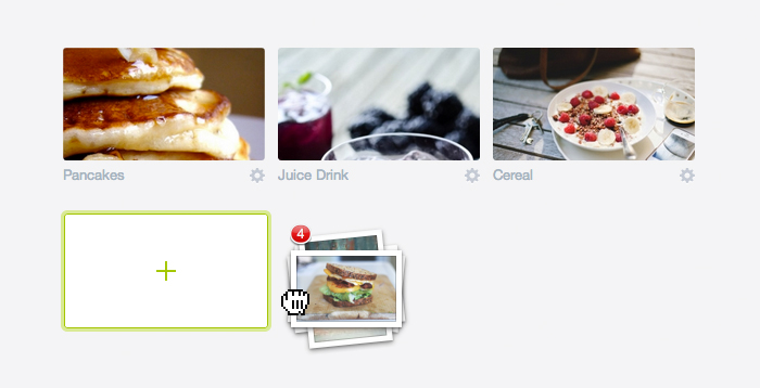
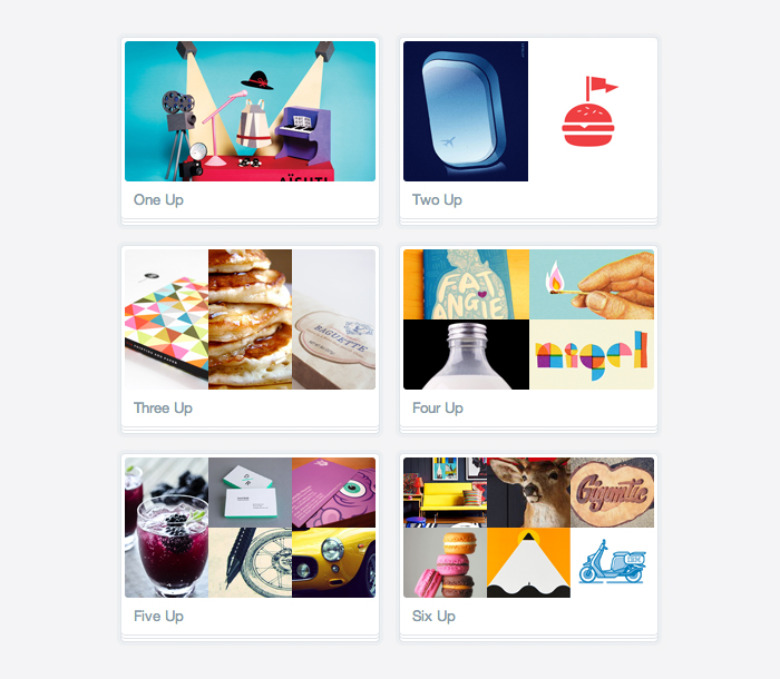
There's a lot of little design touches like this around Prevue, but few features went under quite as much scrutiny as this one. Each thumbnail is proportioned and aligned to make sure it's as big and contextual as possible.
