Well it's been one hell of a year for Prevue, which turned 5 years young in January. As the year comes to a close, and you start to wind down your jobs for Christmas, I thought I'd take a moment to share some of the more interesting stats and observations that can be made from the past 12 months.
There's no easy way to put it... it's been a busy year for you lot — with an average of 36 images being uploaded every single second, you've been creating a fair few pixels. Your clients have been busy too, viewing an average of your 4,800 concepts every minute, and leaving over 500 items of feedback a day! On average, you're uploading 112% more than last year.
My, haven't you grown
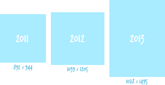
What's also changed this year are the physical properties of the images you've uploaded. Whilst you might have safely guessed that your website designs have steadily increased in width and height, you might be surprised at how much bigger designs are this year vs last. On average, website concepts are 24% taller than last year, and 58% taller than 2011.

And whilst there's been no significant change from the past few years, 2013 has reinforced the fact that Thursdays are the best days to expect client feedback — and that you get most of your uploads done in the afternoons (between 3pm and 10pm).
You changed, so Prevue adapted
With an increased volume of images, much larger files and a greater reliance on online sharing - Prevue has been constantly updating to meet your high expectations. The product saw a major feature release almost every month this year, all with the common theme of making uploading and sharing as easy as possible. Here's how it's gone down...
December: Launched drag & drop upload along with a host of interactive library improvements. Then a week later released iPad drag and drop support, and retina images throughout the app.
November: One rainy Sunday afternoon, the whole app was moved to brand new, and significantly faster servers - which were required to support the upcoming releases in December. This blog was also launched!
September: A brand new way to replace image (using drag and drop) was released. That was coupled with the ability to add project subtitles, which brought a new level of context to the work you share
August: Better project management was the theme of this months' releases - which saw the launch of Groups, and totally re-designed projects which featured a fully responsive layout
May: The ways you manage projects and customise your account were both improved - the latter with the introduction of drag and drop logo upload... which was secretly laying the groundwork for Decembers' updates.
April: After months of preparation, paid plans were launched alongside an upgrade-only feature called 'Teams' - which gives accounts unlimited upload space, and enables multi-user access
February: Managing larger projects and multiple images got a lot easier with the new 'Bulk Edit' feature, released alongside an improved fullscreen mode, which hides horizontal scrollbars on wide images
A constantly evolving UI
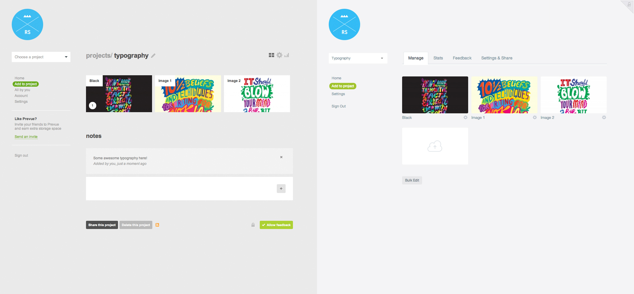
The Prevue interface updates and improves almost every single week - I am, afterall, a UI designer by trade. The changes made in 2013 are immeasurable, so here's a visual comparison of how the projects looked in 2012 vs today:

Thanks for the memories!
Releasing features is great, but seeing the positive reaction from you is what makes it all worthwhile. Here's some of the love you've sent this year — thanks for the support! There are plenty of big features and improvements planned for the next 12 months - so by the looks of things, it's going to be a big year for us both. Here's to 2014!
Write a comment