In 2013, I started investigating ways to improve conversions within Prevue - an undertaking that took the best part of a year, but resulted in a 120% increase in revenue. In Part 1 of this article, I outlined how I went about improving engagement, below I'll explain how I tackled conversions.
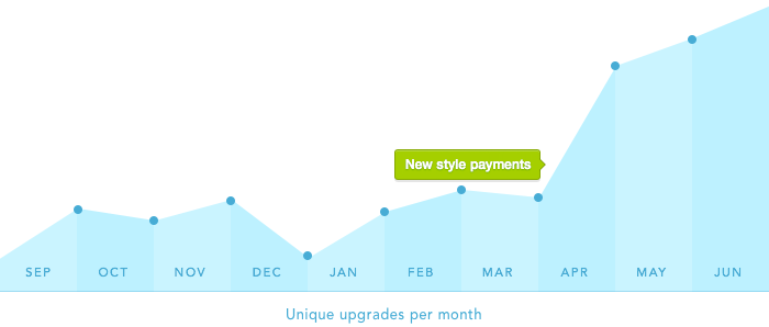
By the end of November 2013 I had increased engagement by 4x, reduced new account churn, and drastically increased image upload rates (above)... but still hadn't made any significant change in conversions.
Why? It seemed that design was the answer.
Update #1:
Reinforcing image limits
Having simplified the product offering, one of the only reasons to upgrade was to increase your personal image upload allowance. Therefore it seemed strange that the app only notified people of their impending limit just before they hit or exceeded it. By that point, upgrades were made through frustration, rather than desire.
Still, imposing limits of any kind is annoying to users, and constantly reminding people seemed a little pushy. So instead, I decided that a good way to keep limits at the front-of-mind was to visually link uploads to remaining space. In the sidebar of all free accounts, and only for people with 5 or more images, I replaced a standard upgrade message with a dynamic progress bar which grew and shrank when images were added or deleted.
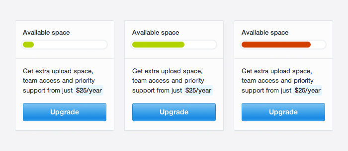
With this fairly unobtrusive bit of UI, people were gently reminded that every new image brought them a little bit closer to their limit. It also gave context to the upgrade message positioned just below it.
Similarly, more relevant (and helpful) messages were also displayed when someone exceeded their image quota, as opposed to simply displaying an error.

Quality over quantity
Because upgrade prompts were being only shown at appropriate times, rather than all the time, the data showed a 12% decrease in pageviews to the upgrade screen. But of those diminished views, there was a huge increase in people clicking 'Upgrade' and entering into the payment process. Overall, targeting upgrades towards more engaged and informed audiences, conversions increased by 17.5%.
A 12% decrease in pageviews, but a 17.5% increase in conversions
Update #2:
Improving the payment process
So far, so good - the numbers were showing that I had increased engagement, and had drastically improved the conversion rate of the upgrade screen. But in reviewing the stats, I noticed that the number of upgrades were much, much less than the number of clicks on the 'Pay with card' button. Something was wrong.

The PayPal problem
I regularly use Prevue to user test the features and experience of my product (read more). I've used every part of the app, 1000 times over... except for one thing; I'd never actually gone through the process of paying for an upgrade.
So to better understand why there was such a drop-off between pressing 'Pay with card' and actually processing a payment, I went through the upgrade process myself. Everything was working great up until I was redirected to PayPal, who handled the payment side of things. Not only was the jump between the Prevue and PayPal websites jarring, I was also presented with the world's longest payment form; PayPal had changed their checkout to force my own customers to create PayPal accounts, or face an intimidating 20-field alternative.
So, faced with a form longer than my tax return, I gave up and decided not to upgrade. As it happens, I wasn't the only one who gave up at this point either. A quick query of the numbers revealed that in just 7 months, 569 unique transactions had been abandoned at this exact point - resulting in a loss of over $14,000 in potential revenue! I didn't need any more convincing — it was time to ditch PayPal.
PayPal's new checkout was losing Prevue at least $67/day
A better alternative
Changing payment solution is no small feat for any product, so it was after a lot of research that I decide to use a company called Stripe to handle all payments. Whilst there were a number of great reasons to go with these guys, their beautiful and simple payment process was the main reason I switched. And even though Stripe costs me slightly more per transaction, and required a significant upgrade to Prevue's servers — my users were now given a much better experience, and the ability to pay directly from within the Prevue app:
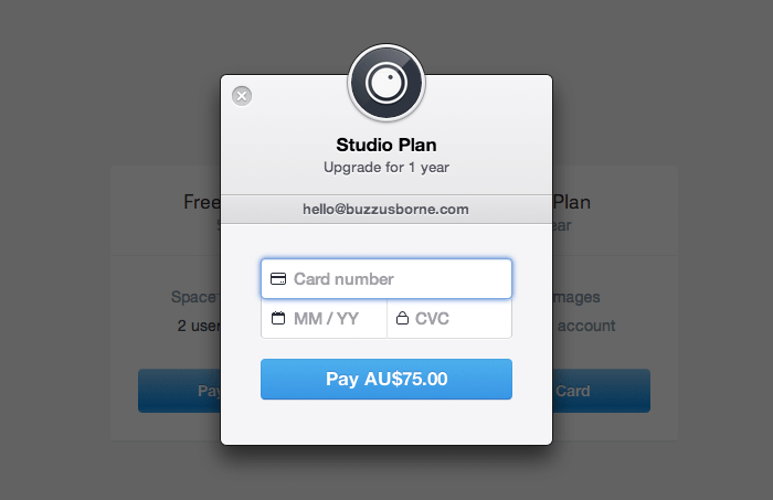
The result? Since switching to Stripe in April '14, the number of abandoned transactions has fallen to zero. That is, everyone who made the decision to upgrade, did. Proof that user experience can have a drastic effect to the bottom line.

A/B test the rest
As any good UX designer knows; great experience is the sum of all the smaller parts. So in addition to the big changes to the interface, there were countless small tweaks made too. Tiny updates were made to the copy, style and flow - each of which were tested to see which worked best. Words like "Upgrade now" were tested against "Pay with card", and green buttons were tested against blue ones, or no button at all.
Interestingly, the most effective small visual change I made was to center Prevue's interface - a very minor CSS change that resulted in a noticeable improvement to engagement. Of course, testing only helps when you have two or more great variations, a hypothesis to prove and a lot of time on your hands. Usually though, testing is best left for the small things, and definitely no substitute for going with your gut instinct.
In summary
By focussing on improving the way people use my product, and by making subtle changes to user experience, I have seen a month-over-month increase in engagement and conversions. Furthermore, I made these changes without negatively impacting user experience, or by changing the feel of the app, and can honestly say that Prevue is a better product as a result. That's something I can stand behind.
Focus on building a useful product, and the rest will follow.
Ignacio Eumarrah
카지노사이트
바카라사이트